High-Conversion Homepage Design
The B2B buying journey has undergone a structural transformation, shifting from a linear, sales-led process to a self-serve, research-intensive exploration.
Market data from Think with Google indicates that researchers conduct an average of twelve searches before ever visiting a specific brand's website. Crucially, they are typically 57% of the way through their purchase decision before they are willing to engage a sales representative.
For complex B2B services, the homepage can no longer function merely as a digital brochure. It must act as the primary strategic anchor—the "source of truth" that aligns marketing, sales, and product under a single, coherent narrative.
Based on our analysis of high-performing services and frameworks from industry leaders like Fletch PMM and CXL, here is the detailed framework for a high-converting homepage architecture.
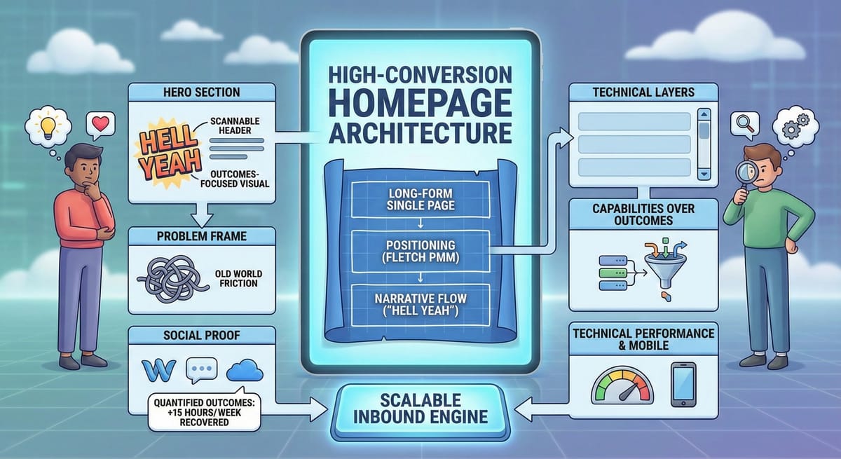
1. The Strategic Shift: Long-Form Single Pages
The architectural debate between traditional multi-page websites and long-form homepages is increasingly settled by evidence favoring the latter for complex, high-value services.
- Conversion Metrics: Usability metrics from CXL consistently show that single-page structures outperform multi-page sites. While multi-page sites often cap at 2% to 3% conversion due to "choice paralysis" and navigation dilution, well-architected single-page structures typically convert at 9% to 20%, with top performers reaching 30%.
- Cognitive Design (Fiends vs. Foes): A vertical narrative satisfies two distinct consumer behaviors:
- "Explanation Fiends": Analytical thinkers who require deep technical discussions and objective reasons to buy. They need the deep scroll to find technical validation.
- "Explanation Foes": Intuitive thinkers who make decisions based on gut feeling. They need scannable headers, high-impact visuals, and outcomes-focused hero sections.
The Solution: A fluid, vertical narrative places emotional hooks at the top for the "Foes" while providing progressively deeper technical layers for the "Fiends" as they scroll.
2. Positioning: The Fletch PMM Framework
Failures in conversion often stem from positioning rather than design. Anthony Pierri and Robert Kaminski of Fletch PMM argue that most B2B homepages fail because the underlying positioning is disconnected from execution. A state-of-the-art homepage must answer four fundamental questions within seconds of arrival:
- What is it? Define the category clearly. Be specific rather than broad.
- Who is it for? Define the audience specifically (e.g., "Series A-C Tech Startups" rather than just "Businesses").
- What does it replace? Define the competitive alternative. Do you replace a manual team? A fragile web of spreadsheet hacks?
- Why is it better? Define the differentiation mechanism. Focus on the unique mechanism that alternatives lack.
Category vs. Use Case: In emerging tech sectors, use-case positioning is often superior. Instead of anchoring to a broad category, anchor to a specific workflow problem.
3. Messaging: Capabilities Over Outcomes
A recurring mistake in B2B positioning is leading with abstract business outcomes like "Save time" or "Increase revenue" without explaining the capabilities that make those outcomes possible. Buyers are skeptical of "outcome-first" messaging because they lack the trust that the provider can deliver.
- Strategy: Adopt a "capabilities-first" approach. Map specific technical abilities of the platform to the user's "Jobs To Be Done."
- Logic: Buyers believe the outcome only after they understand the capability. Once they see the how, they will believe the why.
4. Narrative Flow: The "Hell Yeah" Architecture
The transition from a "confused observer" to an "excited buyer" happens through a structured narrative flow that mimics a high-stakes sales conversation:
- Hero Section: Achieve "Message-Market Match" immediately. Use a header that states the use case, a sub-header describing the capability, and a high-fidelity visual of the system at work—never stock photos.
- Problem Frame: Vividly describe the "Old World" friction—the manual data movement and "robotic" work that drains employee morale.
- The "New World" (Mechanisms): Articulate the generational leap. Contrast the "Old World" of rigid, manual logic with the "New World" of your specific solution. Explain how your system handles ambiguity where traditional methods break.
- Social Proof: Deploy specific integration signals to show ecosystem compatibility and include quantified outcomes rather than generic testimonials.
5. Mobile Readiness and Technical Performance
Mobile usage in the B2B purchase path has intensified. According to Google, there has been a 91% increase in mobile use throughout the entire journey. Nearly half of B2B researchers use their phones at work to compare features and prices.
- Responsiveness: If a site is not perfectly responsive, conversion will plummet regardless of positioning strength.
- Speed: Research suggests a 4.42% decrease in conversion for every second of load delay.
Adopting this architecture shifts the homepage from a passive informational asset to a scalable inbound engine. In an ecosystem where speed and efficiency are the primary currencies, a homepage that moves a buyer from "hmm" to "hell yeah" is a competitive moat.
Thanks for reading and thanks to all of the leaders in our space (Kaminski, Pierri, CXL, others) for showing the way.
Troy